CI Expo – katalog
MB Retrospektiva

O projektu
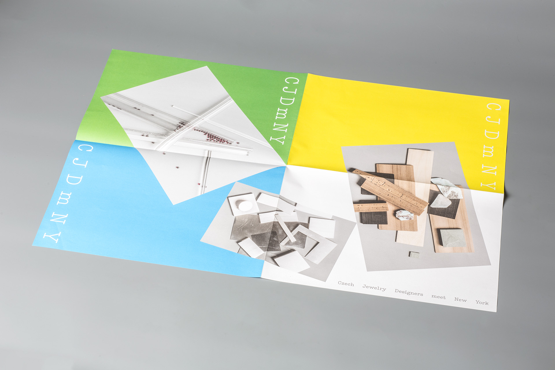
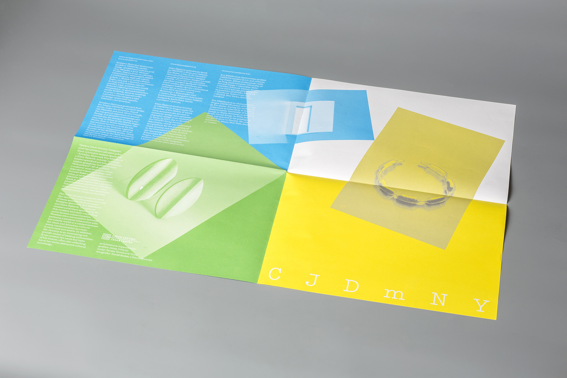
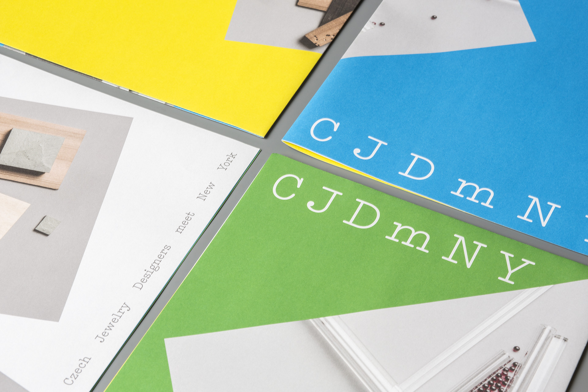
CJDmNY
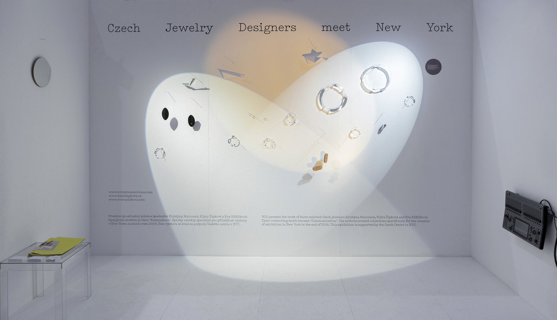
Czech Jewelry Designers meet New York. Tři šperkaři, tři barvy. Fotografie struktur materiálů, se kterými pracují. A plakát jako hlavní propagační materiál - různě poskládaný a různě interpretovatelný v barvě a obsahu. Písmo jako parafráze na slavné logo “I love New York”, tedy modernizovaná verze písma American Typewriter.
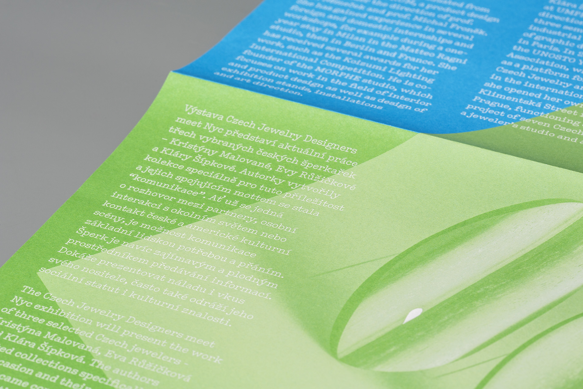
Také použití grafiky na výstavách je jednoduché – barvy dýchají a text je dobře čitelný. Jedna verze pracuje se třemi světelnými body, druhá, vytvořená pro výstavu v New Yorku, je protkána barevnými vlasci.
spolupráce:
architektura výstavy Hippos design, Radim Babák a Ondřej Tobola.
tagy:
katalog, plakát, identita výstavy
Odkazy
MgA. Adam Uchytil
grafický design a vizuální komunikace
uchytil.adam@gmail.com
+420 776 288 754